October 5, 2012
Weekend Website #112: Nanoogo
Are your students visual learners rather than linguistic? If you answered yes, you’ll want to visit this site. 
Age:
Grades 3-8
Topic:
Visual communication
Address:
Review:
Twenty years ago, Howard Gardner proposed the concept of multiple intelligences–seven approaches to learning–and education was changed forever. No longer was it sufficient to teach only linguistically. Gardner effectively made the case that many children don’t learn well under that approach. ‘Teaching’ requires a mixture of seven learning styles (visual, kinesic, musical, interpersonal, intrapersonal, linguistic, and logical-math).
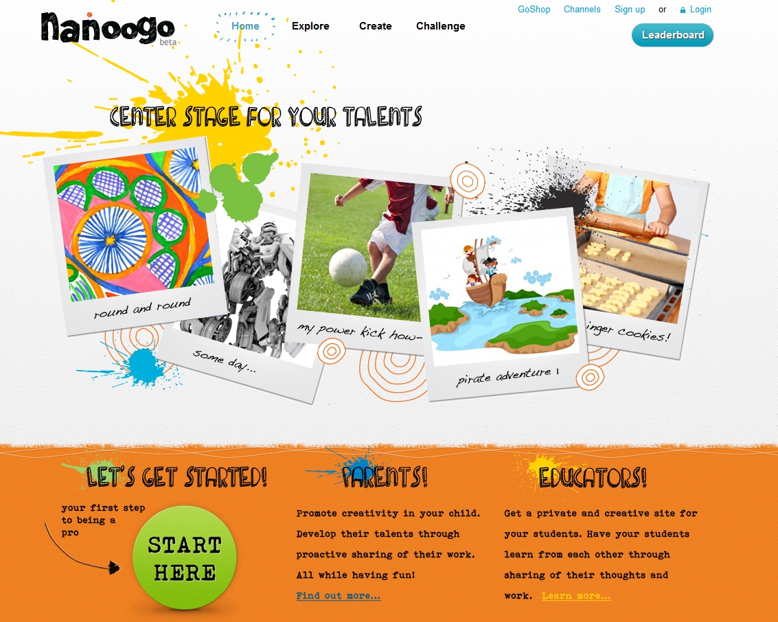
Since then, educators have struggled with how to deliver content that reaches these extraordinary learners. The maturing of the internet has provided the means to differentiate instruction. One such tool is Nanoogo, a site that’s variously been called an ‘eportfolio solution‘ and a blog. The creators call it a ‘center stage for kids to show ‘n tell’
I think all those descriptions sell it short.
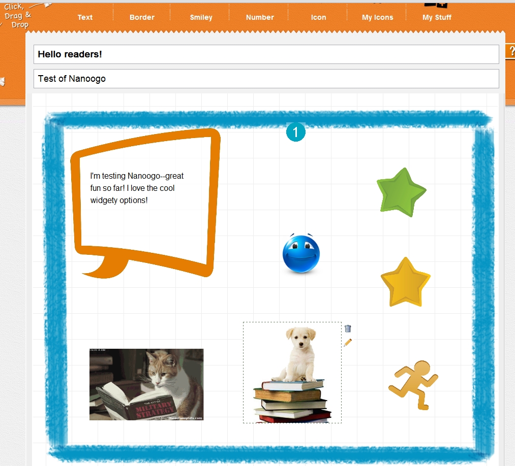
It’s a visual communication canvas. In an education environ steeped in dated PowerPoint slideshows and de rigeur classroom plays, Nanoogo provides a way for students to share ideas with words, images, color, and even movement (see my reading cat in the example below). In school, this provides the opportunity to present book reports, biographies, an exploration of a classroom theme without students being forced to write pages, put on acting caps that don’t fit, or tackle technology skills that churn their stomachs with angst. In Nanoogo, they have a web-based tool that might be exactly what they require to communicate ideas. and, once students create their message, it can be published (a popular requirement with current education standards) to a wide or narrow community (called ‘channels’) and opened for feedback from classmates. Parents are invited to check out what their child has posted.
I decided to try Nanoogo–see if it was as good as it sounded. I signed up for an individual account (what a parent or homeschooler might choose). It requires a parent email–good transparency though it’ll be a problem with kids who don’t know this detail (I discovered later that Nanoogo had solved this with an education channel that funnels sign-ups through the teacher). My account set and active, I picked an avatar from among dozens available and then a personality (like Adventurer, Story-teller, that sort). It then provided an overview of Nanoogo for users–just the basics and done visually so students won’t click through and miss out on what to do with this new site.
That done, I was taken to my first post (for a Vimeo video of how easy this is, click here). I use the term ‘post’ loosely. Sure, it includes text (displayed as thought bubbles–love that), but also drag-and-drop borders, smileys, numbers, and more. Everything’s easy to use and requires skills students have already learned in other techie experiences.
Here’s an example:
See the ‘my stuff’ button on the top right? That’s where students can collect their drawings, creations, and more to input into a canvas.
Work can be posted to share with a class or a wider group. And when it’s a class, students can visit the creations of their piers and comment with words and icons. This is so in-tune with Common Core thinking to publish and collaborate.
Here are more thoughts on the website:
- The site’s mission is perfect–
…to provide kids with a fun online platform to develop their creative talents and share them with the world! We’re a start-up company founded by passionate fathers and technology visionaries, looking to increase creativity in children and help them enhance their many skills.
- It’s free. Always a good start for cash-strapped schools and teachers.
- The website itself is clean and organized, with no distracting advertising. It loads quickly on a variety of platforms. I like that because schools use every browser out there.
- Content is age- and developmentally-appropriate. It is easy-to-use and user-friendly, even for younger users.
- The creators did a good job fulfilling their mandate to ‘provide kids with a fun online platform to develop their creative talents…’
- It’s kind of like Glogster, but easier, with tools more in tune with what younger students would know how to use.
- It’s noteworthy that YouTube and Vimeo videos are not currently embeddable, nor is chatting with friends. Considering the age group of prospective users, I see the latter as a good thing.
- The website is current, with lots of updated information from schools and students who use the digital story-telling features.
- Bloom’s learning objectives are encouraged, i.e., cognitive functions of analyzing, remembering, and creating.
- NETS standards are also satisfied, asking students to ‘demonstrate creative thinking, construct knowledge, and develop innovative products and processes using technology’.
- Not to be left out, Common Core standards for publishing, sharing, and collaborating are addressed.
One last item: I find it fascinating what motivates the average person to create the unknown. Here’s Jason’s backstory (one of Nanoogo’s founders):
As a volunteer Sunday school teacher, I saw an opportunity to leverage my software engineering expertise to build a platform that could enable kids to capture their creativity and talents and share them with the world. Too many times, I spoke with parents after class and they didn’t even realize how talented their children really were. The children also lacked the positive reinforcement and engagement from parents and peers to help push them. One day at my friend’s house, I even found their child’s great school research presentation crumpled on a bookshelf.I founded Nanoogo because I want to see the efforts to boost their true talents as a parent, as a teacher, and as a society.
These are sentiments we can all relate to.
All in all, a wonderful start for this new website.
To sign up for Weekend Websites delivered to your email, click Weekend Websites here and leave your email.
Jacqui Murray is the editor of a K-6 technology curriculum, K-8 keyboard curriculum, creator of two technology training books for middle school and six ebooks on technology in education. She is the author of Building a Midshipman, the story of her daughter’s journey from high school to United States Naval Academy. She is webmaster for six blogs, an Amazon Vine Voice book reviewer, a columnist for Examiner.com, Editorial Review Board member for Journal for Computing Teachers, Cisco guest blog, Technology in Education featured blogger, IMS tech expert, and a bi-weekly contributor to Write Anything. Currently, she’s editing a thriller that should be out to publishers next summer. Contact Jacqui at her writing officeor her tech lab, Ask a Tech Teacher.


